
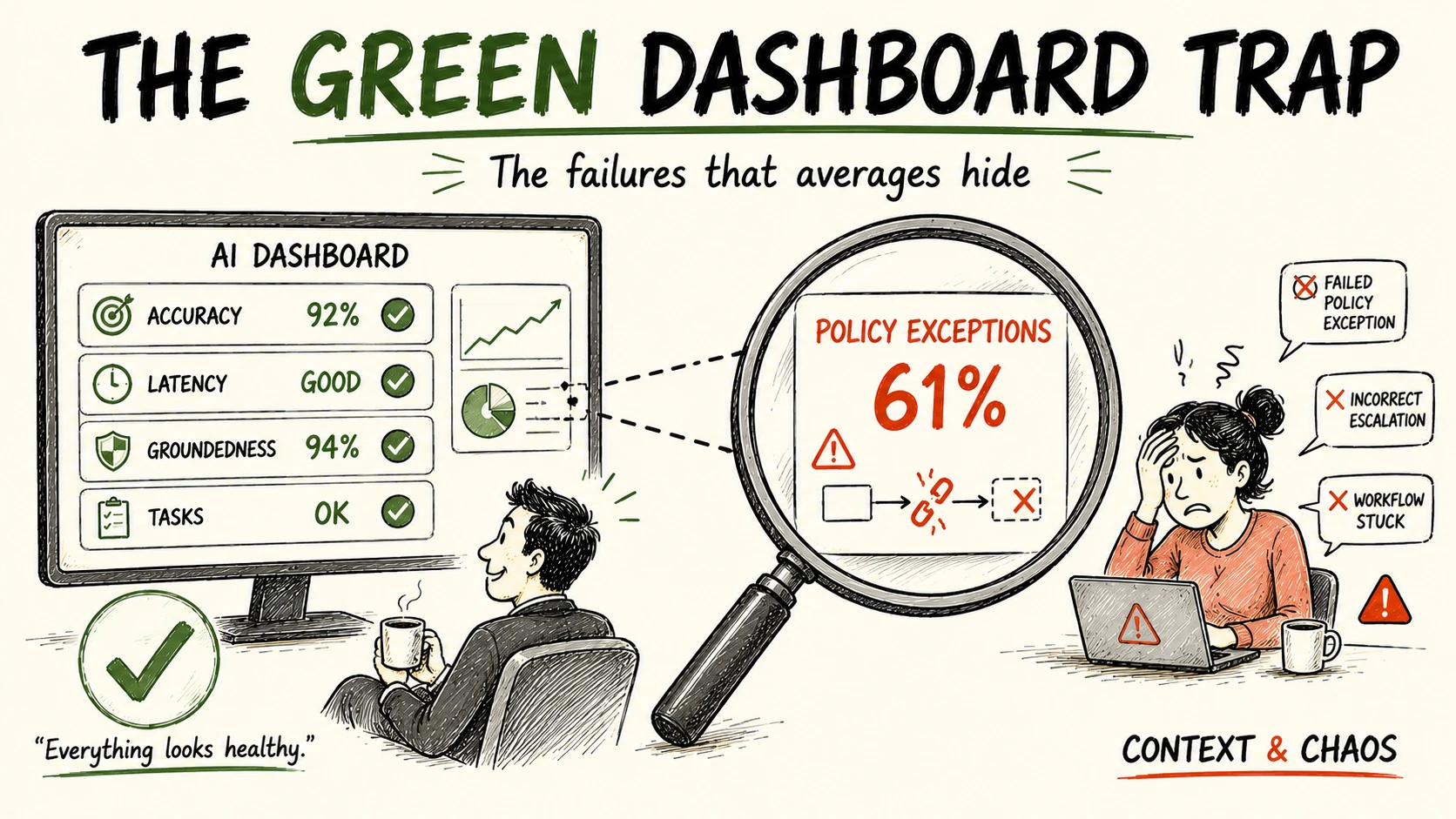
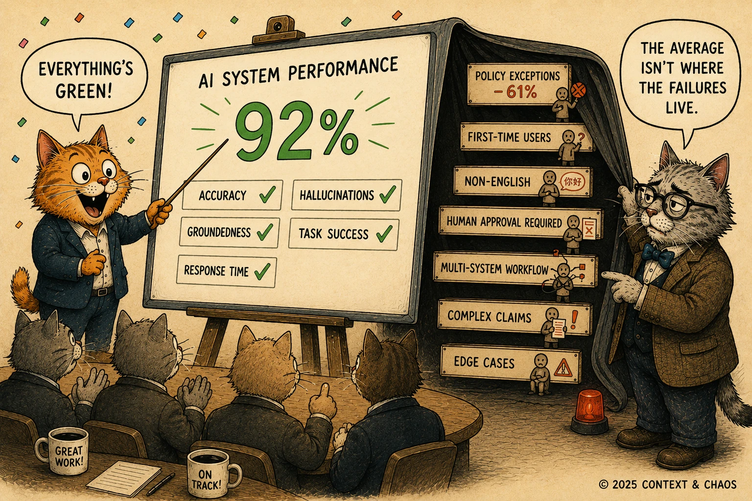
The dashboard displays 92%. The customer experiencing the exception experiences 61%.
Both numbers describe the same AI system in the same week. Picture the review that runs on the first one. The board is green. Accuracy, task completion, and response times all sit within target. By every visible measure, the system is succeeding.
Then the complaints arrive. Not many at first. A failed policy exception here. An incorrect escalation there. A user unable to finish a workflow that should have taken minutes. Individually, each looks isolated. Together they form a pattern the dashboard cannot see.
The question is simple: how does a system that looks successful on every chart keep disappointing real users? The model is doing its job. The measurement system is not.
The Comfort of Averages
For decades, machine learning teams have relied on aggregate metrics to understand system performance. Accuracy, precision, recall, F1 score, and more recently groundedness, faithfulness, relevance, and task completion rates have become the language of AI success.
These metrics serve an important purpose. They compress millions of interactions into numbers that humans can interpret and executives can track. But every act of compression comes with a cost.
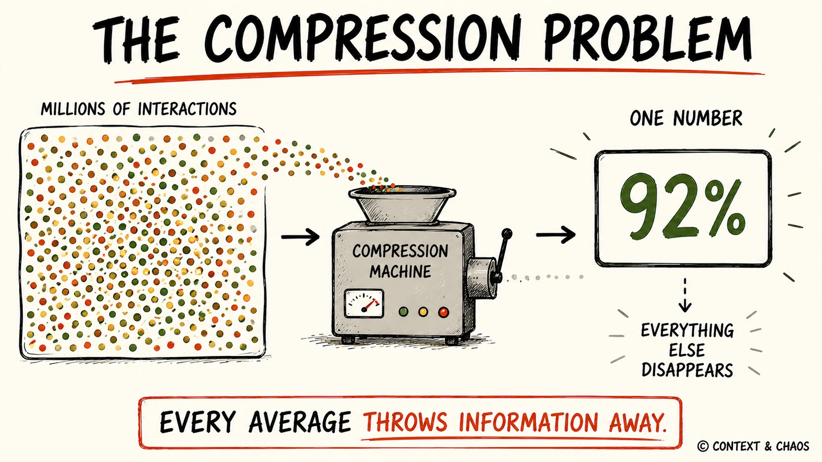
The Compression Problem: averages discard context | Source: Context & Chaos
Return to that 92%. On paper it looks excellent. A closer breakdown tells a different story.
- For simple workflows, the success rate is 96%.
- For moderately complex workflows, it is 90%.
- For workflows involving policy exceptions, human approvals, regulatory constraints, or unusual customer situations, the success rate falls to 61%.
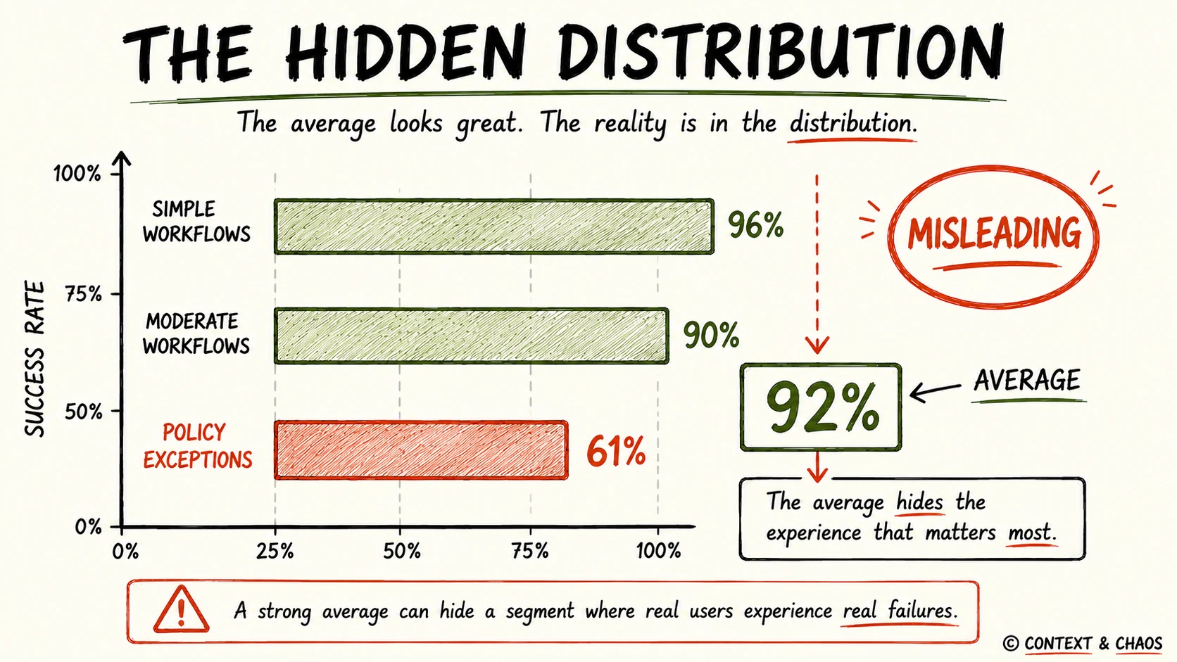
The Hidden Distribution: one number hides many realities | Source: Context & Chaos
The dashboard shows 92%. The customer inside that 61% segment lives in a different system. Both numbers are technically correct. Only one reflects reality for that customer. This is the hidden danger of aggregate metrics: they describe the average experience while concealing the experiences that matter most.
From Predictive Models to Autonomous Systems
Subgroup failure is not new. Traditional machine learning systems often posted strong overall numbers while underperforming for specific customer groups, regions, or products, and teams eventually learned to monitor calibration, drift, and segment-level behavior. Fairness researchers built a discipline around it: measuring performance separately across subgroups is a core task in AI fairness assessment.
The most cited example predates agents entirely. In 2018, an audit of three commercial facial-analysis systems from major technology companies reported overall accuracy that looked strong, then broke the results down by skin tone and gender. Error rates for lighter-skinned men stayed at or below 0.8%. For darker-skinned women they reached 34.7%, and in two of the systems the darkest-skinned women were misclassified close to half the time (Buolamwini and Gebru, 2018). The aggregate score hid a subpopulation the systems barely worked for. Disaggregating the results is what made the failure visible.
That subpopulation was demographic. In enterprise systems it is more often operational, a workflow type or a document class, but the mechanism is identical: a strong average absorbs a segment that is failing. A retrieval-augmented generation system may answer thousands of questions correctly while failing whenever one document type appears. An assistant may handle routine inquiries well but break whenever information spans multiple repositories. An autonomous agent may clear most workflows yet fail the moment tools must coordinate, an approval is required, or an external system returns something unexpected.
In generative systems, the failure surface spans document types, knowledge domains, languages, query complexity, and user expertise. In agentic systems, it spans workflow types, exception paths, approval chains, and tool orchestration. As systems grow more capable, their failure modes grow harder to see. Greater capability produces greater opacity.
When the Dashboard Becomes the Problem
When organizations hit poor AI outcomes, the instinct is to improve the model: swap the foundation model, rewrite prompts, upgrade embeddings, widen the context window, add tools. Sometimes that helps.
Often it does not, because many production failures originate well before the model runs. The cause may be data drift, an incomplete knowledge representation, weak retrieval orchestration, or relationships between entities that exist in the organization but were never formally modeled. Sometimes it is only that real business processes are more complex than any benchmark dataset suggests.
The system is behaving exactly as designed. The measurement is not showing where it breaks. The dashboard becomes the blind spot.
The Segment You Didn’t Define
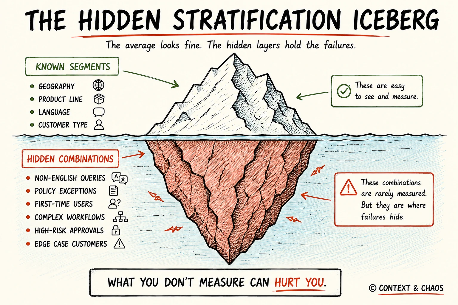
The Hidden Stratification Iceberg: unknown segments, hidden failures | Source: Context & Chaos
Breaking metrics down by segment catches the failures a team already suspects. The expensive ones live in segments nobody thought to define. Researchers call this hidden stratification: a model posts strong aggregate numbers while consistently failing an unrecognized subset of cases that was never labeled or measured (Oakden-Rayner et al., 2020). The original study found relative performance gaps of more than 20% on subsets that mattered clinically, inside models that scored well overall.
The subset is usually defined by a combination, not a single field. A model can perform well on non-English queries and well on policy exceptions, yet fail on non-English queries about policy exceptions from first-time users. No single-dimension breakdown surfaces that cohort. Only an intersectional view does, or an automated search that looks for underperforming groups nobody hypothesized in advance.
That combination is rarely random. In high-stakes decisions, the worst-performing segment tends to be the population the safeguard was built for: the unusual claim, or the applicant who does not fit the standard profile. Measurement that averages those cases away also averages away the risk that carries the most legal and reputational weight.
What Good Evaluation Looks Like
More benchmarks will not close this gap. Visibility into where the system fails will. Organizations should treat subgroup evaluation as a first-class requirement, not an afterthought.
Every headline metric should be broken down by the dimensions that carry risk: customer segment, geography, language, product line, user expertise, workflow type, query complexity, document category, and business function. Slicing by declared dimensions is the starting point, not the finish. Pair it with a search for underperforming cohorts nobody defined ahead of time, because those are the ones hidden stratification produces.
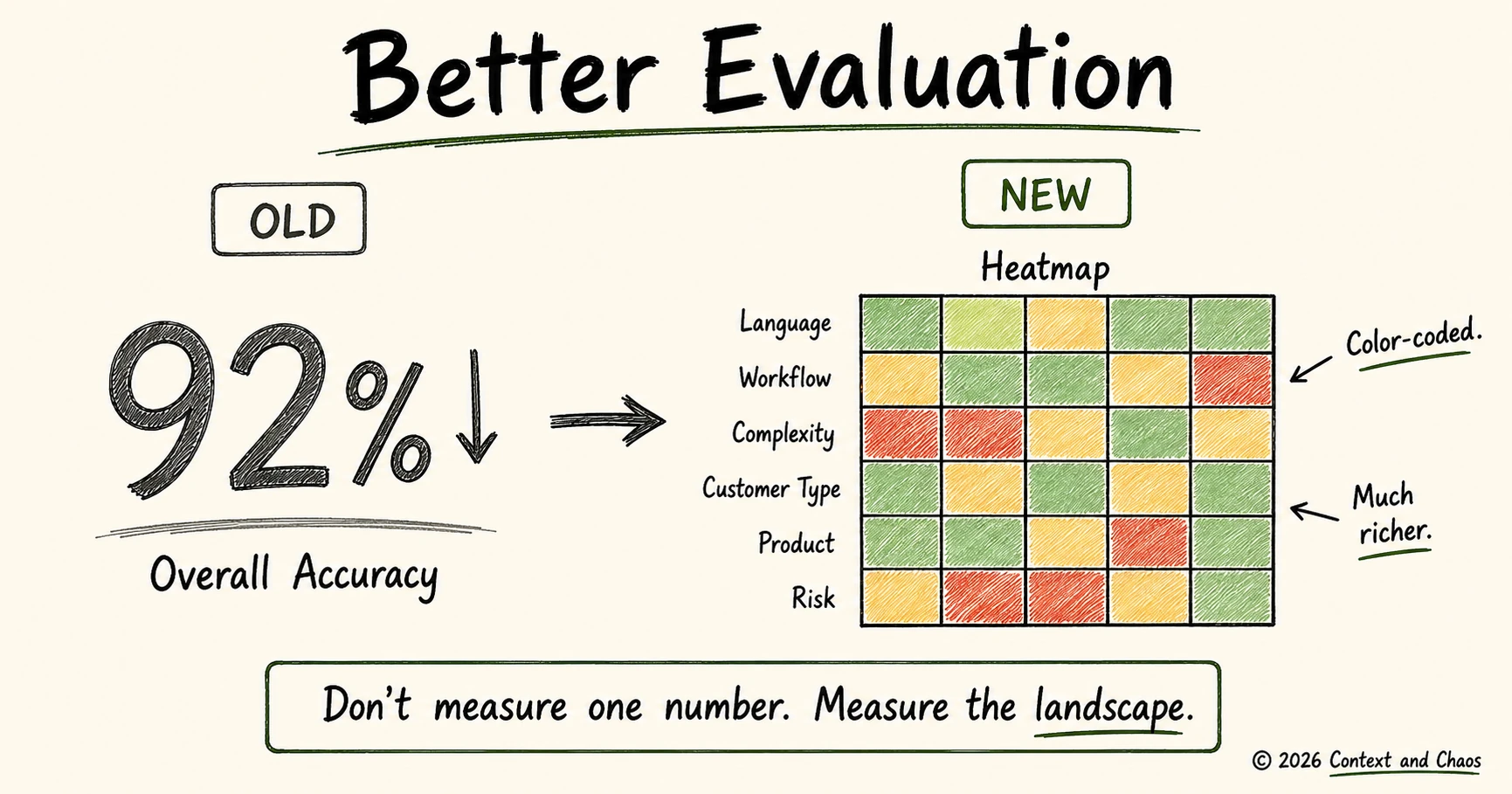
Better Evaluation: measure where systems break | Source: Context & Chaos
Slicing has its own failure mode. Cut the data too finely and the rare segments, often the ones that matter most, end up with too few observations to trust. A 61% success rate drawn from nineteen cases tells you almost nothing. The discipline is to slice by segments large enough to measure and important enough to matter, then treat a thin but high-stakes segment as a reason to gather more data before drawing conclusions.
The question should no longer be “How accurate is the model?” Instead ask: “Accurate for whom?”
Performance distributions often reveal more than averages. The worst-performing segment may tell you more about system risk than the overall score. Monitoring should make subgroup performance visible by default, not something teams investigate only after failures occur. The teams that build this in early gain something their competitors cannot see: an accurate map of where their systems actually fail.
Where this is heading
For years the competitive question was whose model was better. That question is closing as frontier models converge on capability. The next one is quieter and harder: whose team knows where its systems fail, and who they fail. That knowledge does not come from a better model. It comes from measurements built to show the segments the average hides. The most dangerous AI failures are rarely the ones a dashboard reports. They are the ones it averages away.
Note: Views expressed are those of the contributor. All submissions are vetted for quality and relevance. Context and Chaos is information-first: no promotions, paid or otherwise.
The Cats of Context & Chaos
References
Buolamwini, J., and Gebru, T. (2018). Gender Shades: Intersectional Accuracy Disparities in Commercial Gender Classification. Proceedings of the 1st Conference on Fairness, Accountability and Transparency, PMLR 81, 77–91. https://proceedings.mlr.press/v81/buolamwini18a.html
Oakden-Rayner, L., Dunnmon, J., Carneiro, G., and Ré, C. (2020). Hidden Stratification Causes Clinically Meaningful Failures in Machine Learning for Medical Imaging. Proceedings of the ACM Conference on Health, Inference, and Learning, 151–159. https://arxiv.org/abs/1909.12475
About Context & Chaos
Context & Chaos isn’t just a newsletter. It’s shared community space where practitioners, builders, and thinkers come together to share stories, lessons, and ideas about what truly matters in the world of data and AI: context engineering, governance, architecture, discovery, and the human side of doing meaningful work.
Our goal is simple, to create a space that cuts through the noise and celebrates the people behind the amazing things that are happening in the data & AI domain.
Whether you’re solving messy problems, experimenting with AI, or figuring out how to make data more human, Context & Chaos is your place to learn, reflect, and connect.
Got something on your mind? We’d love to hear from you. Hit Reply!
Share this article