Primary color
Atlan Blue is the cornerstone of our visual identity. It serves as the primary anchor that binds our brand together across every touchpoint, channel, and experience, making our presence instantly recognizable.
Blue 500
Atlan Blue is the cornerstone of our visual identity. It serves as the primary anchor that binds our brand together across every touchpoint, channel, and experience, making our presence instantly recognizable.
Cyan serves as our primary accent color, designed to add emphasis and focus. Never use Cyan as a standalone brand color or as a background fill.
Pink introduces a deliberate pop of color to our ecosystem. To maintain its visual impact and prevent it from overpowering our primary palette, use this supporting accent exceptionally sparingly.
Our neutrals palette provides the essential structural foundation for our visual design. These neutrals establish hierarchy and deliver optimal legibility across typography, borders, and UI elements.
To ensure an accurate translation of our brand hues in print media, always use CMYK color values. Use PMS codes if specified by the vendor.
Blue 500
Cyan 500
Pink 500
Our approved color pairings are engineered to maximize legibility, contrast, and brand emphasis across all mediums.
Do
Avoid
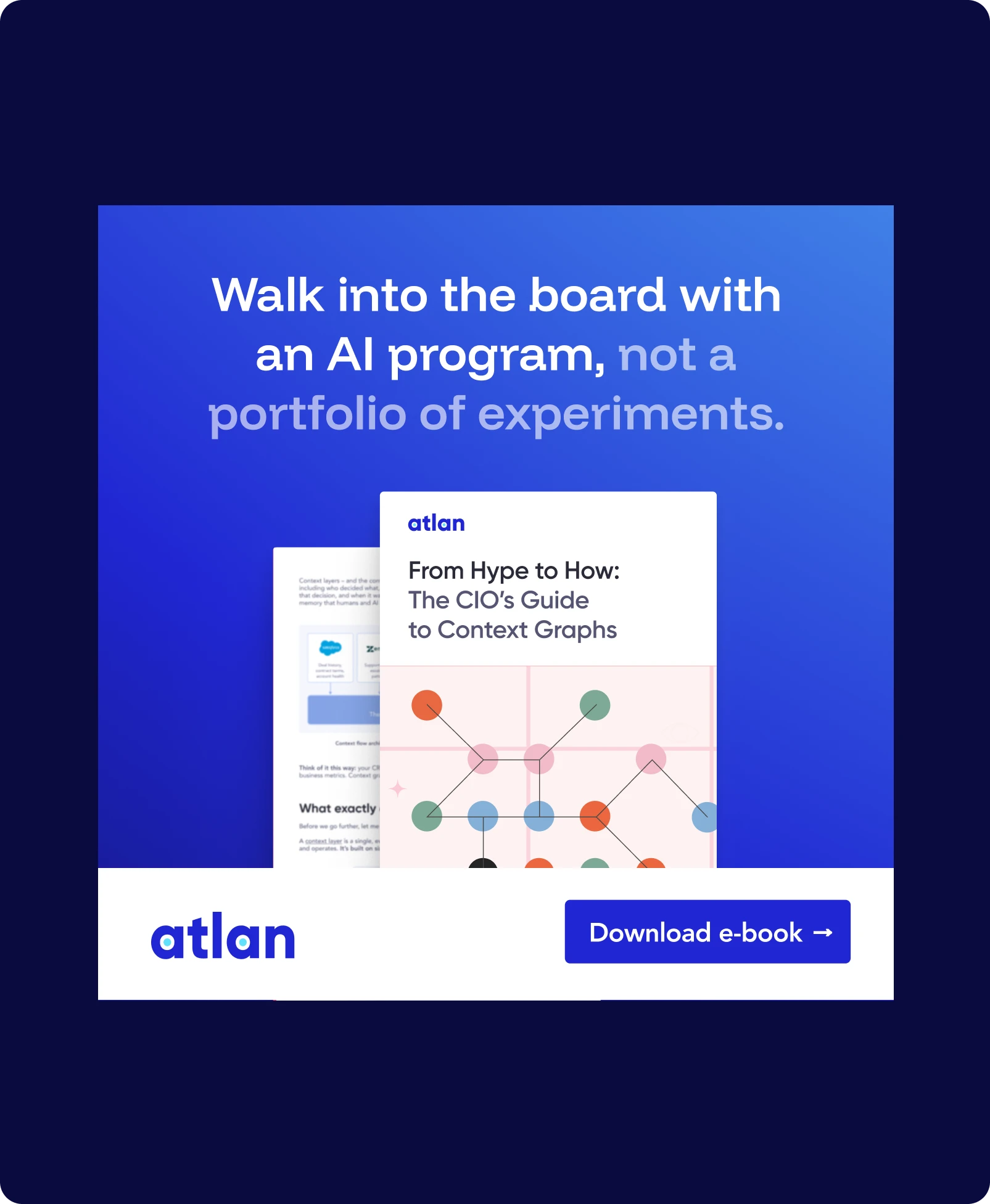
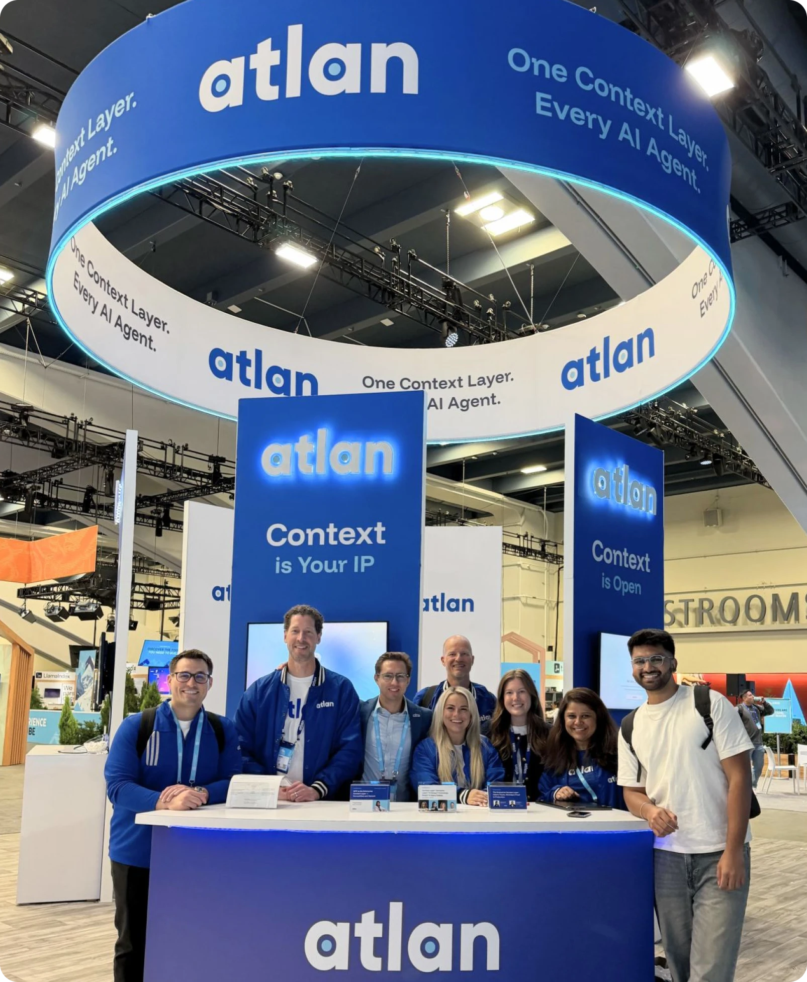
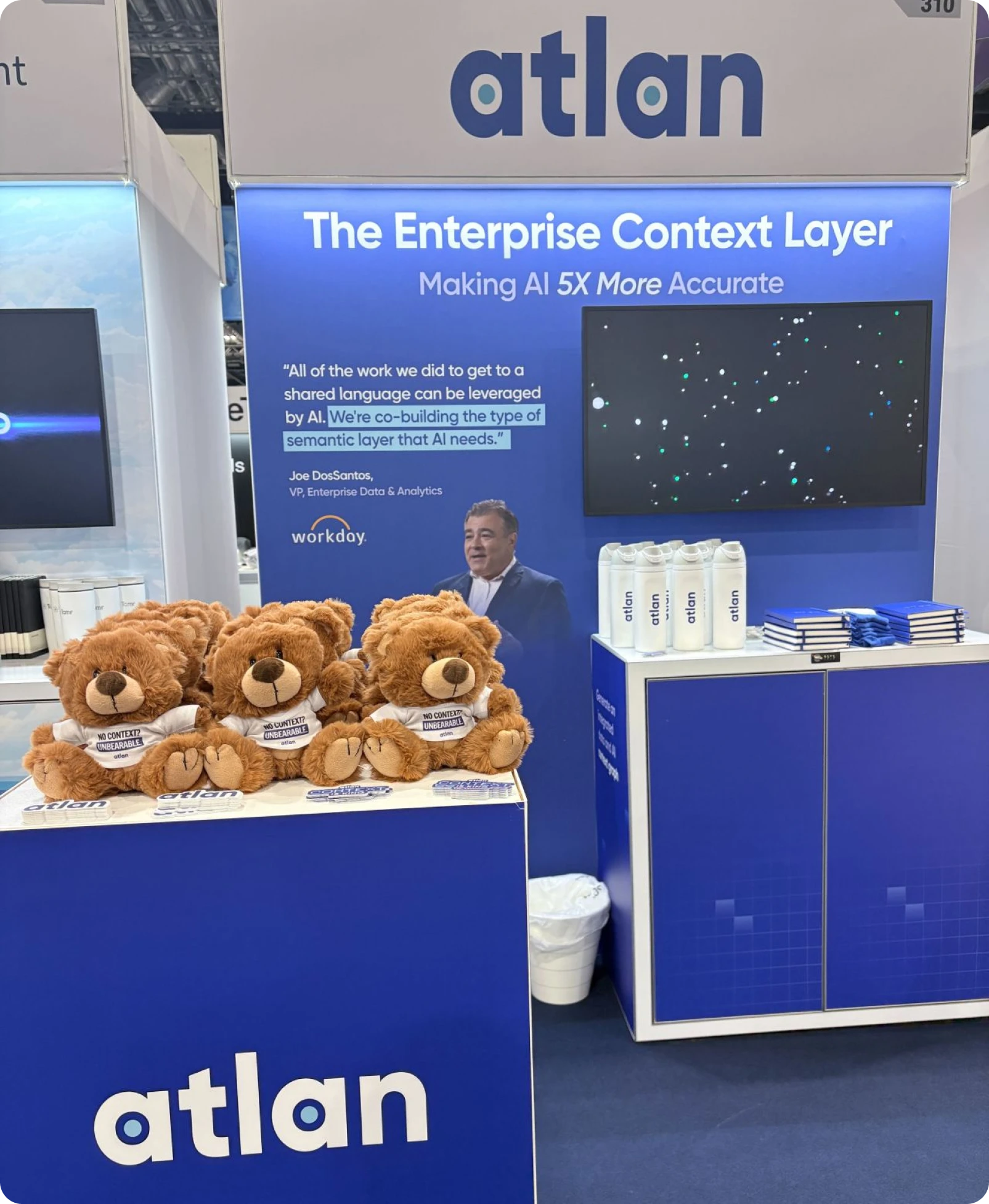
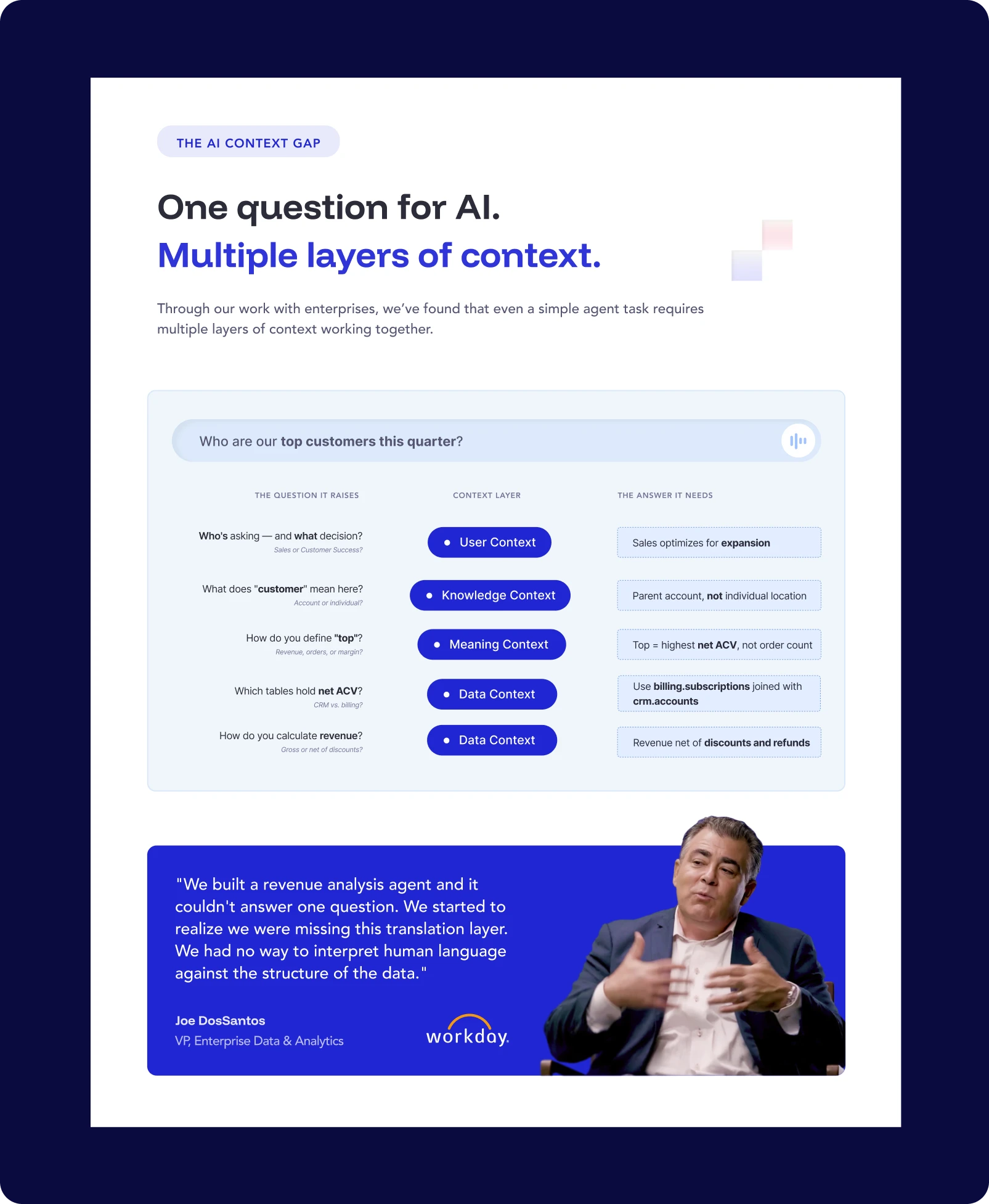
Explore how our color system comes to life across diverse mediums.